With the latest Maxis Monthly The Sims team announced a huge rebranding in The Sims 4. We will get new boxarts, renders, logo, loadings screens, main menu and even the icons are getting a revamp. I think they are trying to target a younger audience with the new bold/vibrant colors they’ve chosen for the design.
Brand New Boxarts
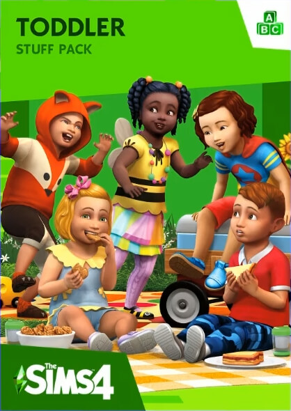
All the boxes will get a new look, not just the base game. Some of the boxes even got new renders. The new items you’ll see on the base game boxart will be included in the new patch coming to PC on July 16th, 2019.

Pack Boxarts
The new boxart for expansions, game packs and stuff packs.
The Sims 4 Logo Redesign
They got rid of the gradients and using bold colors instead. Click on the logo for a high resolution version.
New Plumbob Design
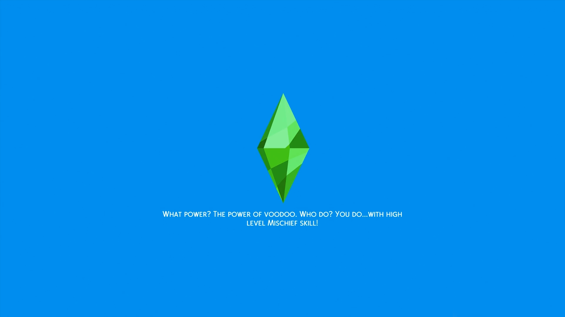
We’ve got a very shiny new plumbob! I’m very excited to see the loading animation in game for this one.
The New Main Menu
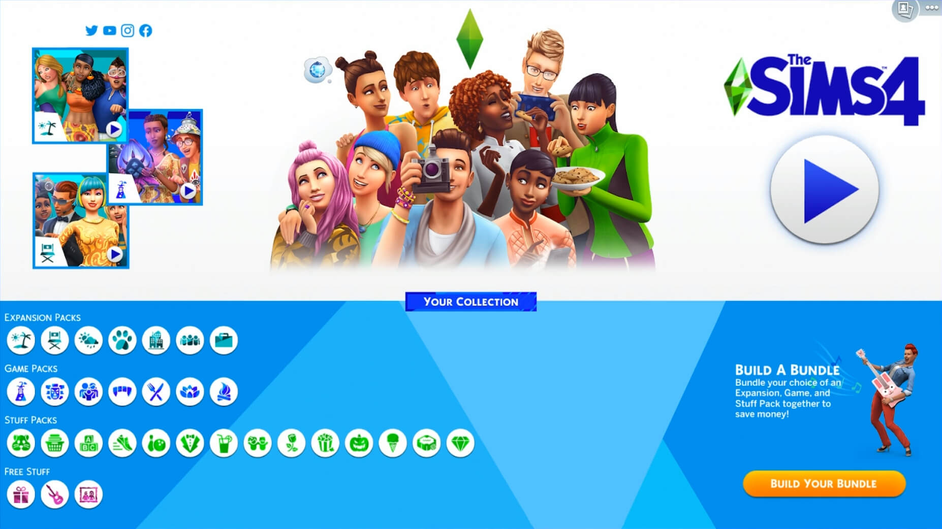
This will go into effect on July 16th, 2019. You can see a whole new interface, icons and they’ve added socials in the upper left corner. “Build Your Bundle” will get the primary focus on the main menu.
Loading Screen
You will see this loading screen next week when you’ve updated your game.


Garbage
Harsh and unappealing…never have i been unhappy with Sims designs, always thought it was glossy and smooth, but now looks like the colours of old pc games, that royal blue is like a Windows screen ?
Yay, I hate it!
thank you